
❋✱✣
Public Information SystemChenequa
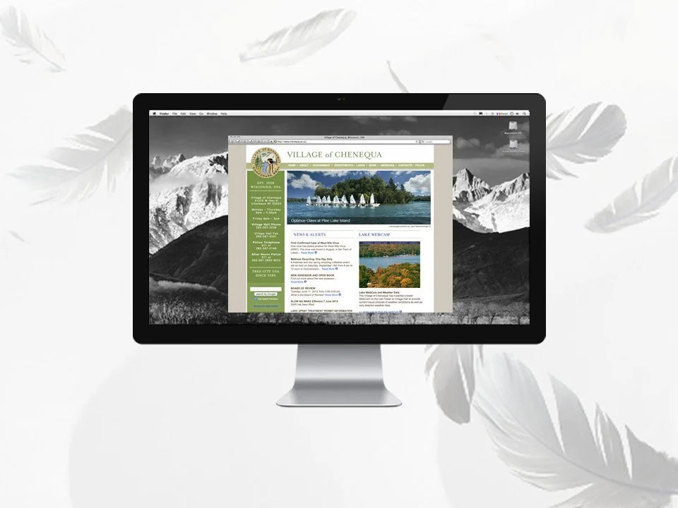
Village Homepage in a Desktop Browser
Police Homepage in a Desktop Browser
Currently Featured Project is in Process
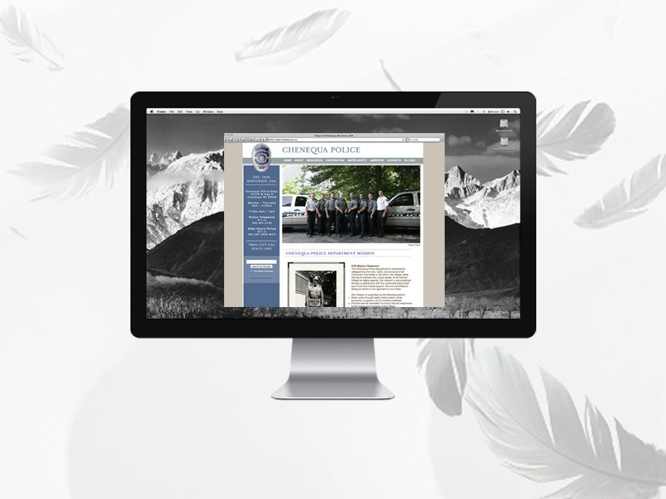
Project Management: Senior Graphic Designer and Creative ConsultantThe Original SituationResearch DirectionDesign & RationaleResultsBonusFrom start to finish, I pitched, planned, led and launched a complementary set of websites for the Village and Police Department of a local residential lake community. The redesigned public information system included 77+ webpages and 350 municipal documents. I structured the content, navigation and visual systems to improve accessibility, usability and long-term uitilizing cascading style sheet and SEO best practices.
The village needed a proper website to organize the municipal information. From basic queries and forms to ordinances and meeting agendas and minutes, information was frustrating to find. The site was visually and informationally disorganized and chaotic. There was one main long scrolling menu anchored the site as well as a spreadsheet type frame holding the village seal, name and address and village hall photo. The Police Department was especially challenging to navigate as it lived within the village structure instead of beside it. Overall, it was an explosion of information and colors. 💫
There was one long scrolling menu to the left and a couple of additional embedded menus to the top and left in the “body” section of the webpages. When those options were exhausted, navigation could also be buttons and graphics in the body of webpages as well. The Police Department was especially challenging due to the secondary column of left links competing with long scrolling list anchored to the left of all pages. There were also distracting frames in the webpage header separating the historical village seal, village name and a village hall photo. It was an explosion of information and colors. 💫
Branding at the municipal level was new. I reviewed other municipalities and other organizations websites for aesthetics, functionality, features, and content. Few municipalities, especially smaller ones, were doing it as well as commercial entities were. Some places simply had logos and not much more. Harshly gridded and visually garish chaos was the look of the time. The goal was to make it a better product from every angle. Pixel polishing at its finest. 👀
Colors: The Earthy Green and Warm Neutral Gray colors were selected for their natural aesthetic. Green was mainly used for the villae representing the land and nature. A corresponding Earthy Blue was chosen to represent the Police Department and the water orientation of the community. It was designated a “Tree City” and during the redesign also became known as a “Bird City.” The village was proud of the designations and wanted it highlighted on the website.
Fonts: The main font is a traditional serif font with little extra flairs particularly to the Q which is highlighted in the village name. This font was also used for the Main Headers anywhere where small amounts of graphical type could safely be used to be visually pleasing and still technically useful. The body font is???? a traditonally paired font that would work well visually and on the back end in the days of few font choices. A solid choice all around.
Photos: A wonderful local photographer and resident provided beautiful nature shots to feature on the website. I vibrantly retouched and optimized the photos for use in a seasonal slideshow to be swapped each quarter: Spring, Summer, Fall, and Winter.
Webcam: The early technology adopters loved the lakes so much, they had a webcam set up to monitor and post conditions to the homepage.
Design Aesthetic: Traditional and information-rich👩🏻💻
Google analytics was installed on the back end and optimized to capture data. As for the community they were not very interested at the time. They were very outdoors focused and lived in the village to get away from the grind of a city and technology. The land and lakes were a respite. Migrating to a useable and beautiful website would take time and staff direction or enthusiasm of early adopters. The top pages to navigate were: ???????? 📊
The researched and gathered content became so useful that department fielded outside calls from the public looking for more information. It was reaching people well beyond the community as a source of public information. ????Ideally, clients would provide new content to be included. Often the designer also ends up gathering the content as well. 🎯
Natural •
Historical •
Peaceful
〰️
Natural • Historical • Peaceful 〰️
❋ Intentional StructureWe blend guided moments, open exploration, and space to reflect—so the experience feels both focused and fluid.
❋ Collaborative EnergyConnection is a core part of the process. You’ll learn just as much from the group as from the content itself.
❋ Expert FacilitationLed by experienced guides who know how to hold space, encourage participation, and keep things moving with purpose.
❋ A Supportive SpaceOur events prioritize comfort, safety, and respect—so you can show up as you are and fully engage in the process.

Reconnect with your body and mind as you escape the noise of everyday life.
Day OneArrive & Meet
As everyone arrives, we take time to settle in, get comfortable, and begin connecting with those around us. The journey starts here.
Check-In9:00 – 9:30am
Group Activity11:00am
Lunch Break12:30pm
Creative Workshop2:00pm
Dinner6:30pm
How It Works-
Browse our upcoming events to find the one that feels right for you. We host events year-round in all different locations and climates.
-
Sign up and pay all required fees to reserve your spot. If plans change, you can cancel up to 14 days before the retreat start to receive a 50% refund.
-
After booking, we'll send you a Welcome Packet with everything you need to know—detailed schedules, packing list recommendations, add-ons to consider, and more.
-
We'd recommend booking your transportation to and from the event as soon as possible, to ensure you can arrive without any complications or delays.
-
Now all that's left to do is pack your bags and get excited for your new adventure.