
Public Information SystemSt John Vianney
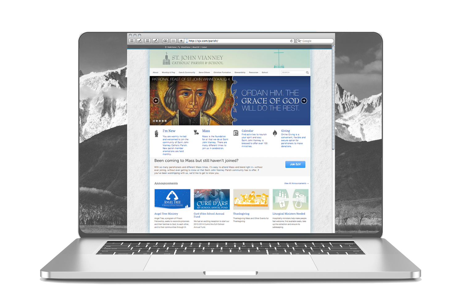
Parish Homepage in a Laptop Browser
Project Management:
Senior Graphic Designer & Creative Consultant
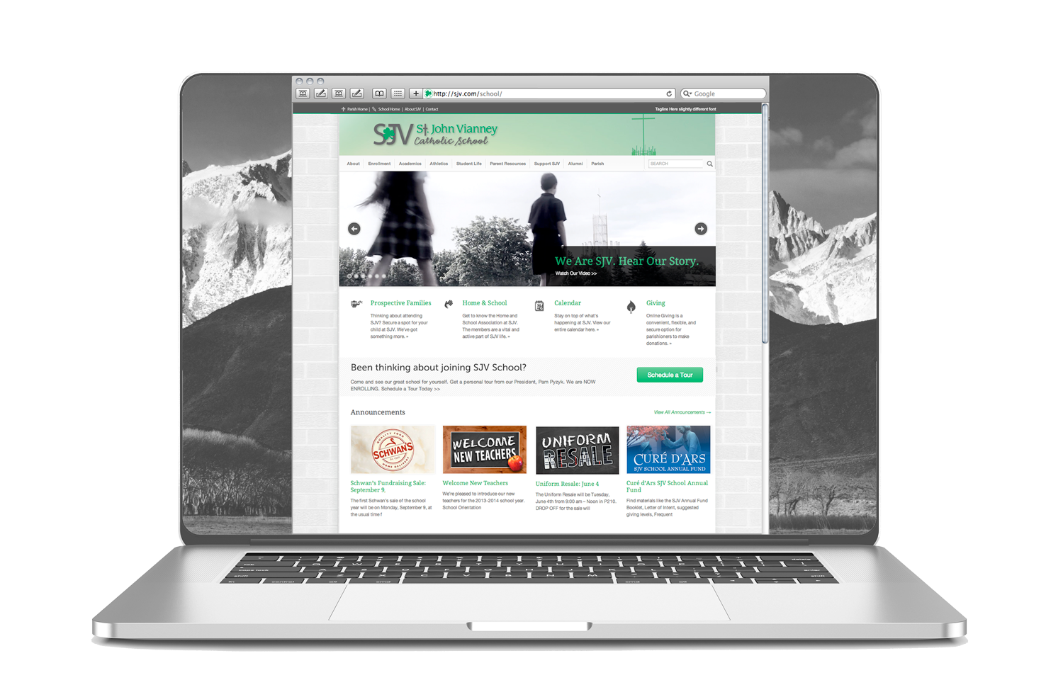
School Homepage in a Laptop Browser
Under Development and Writing
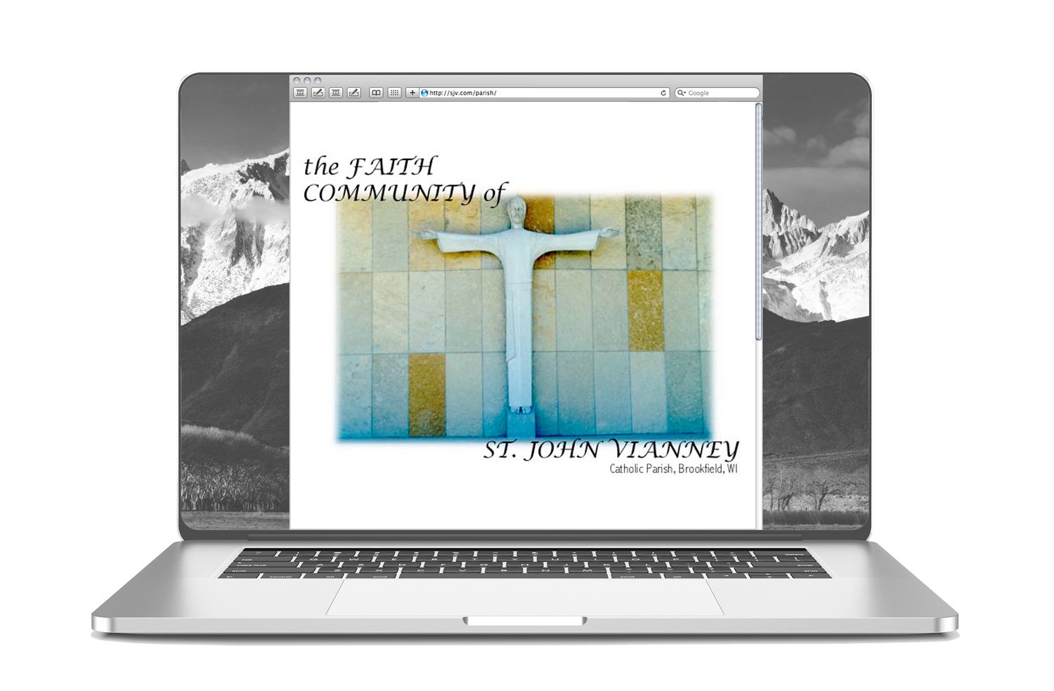
From start to finish, I pitched, planned, led and launched a complementary set of websites for a vibrant suburban parish and school. It has 8,000+ members and 2,000+ families. The redesigned public information system included integrating 250+ pages and many digital documents. I evaluated and structured the content, navigation and visual systems to improve accessibility, usability and implemented SEO best practices, using Google best practices for search-ability and indexing.
Interesting thing about SJV is I did the website twice at different stages of website coding history. SJV was the very first website, I desinged and built before studying design. Much of the original structure and planning was still in place when I redid it the second time around. SJV has already seen web 1.0, 2.0, modular and now mobile design and had 5 versions of a website (One was quite temporary and did not meet the organizational needs.) During this second launch, I had the opportunity to build a brand and extend that brand across all channels. It was new at the time for non-profits to start pursuing such depth of branding to delve deeper into the digital world.
The Situation
SJV needed a proper website to organize the wide variety of events, information, booklets, and forms for the parish and the school. The site became page after page of long lists of text and thumbnails leading to frustrating click paths. The search box was a popular way to navigate the complex site. The school website/webpages were especially challenging to navigate as it lived “nested” and lost within the parish website. It lacked clear visual distinction. Someone added a school logo to help differentiate between the school and parish. Overall, it was an explosion of information and repetition of severe colors. 💫
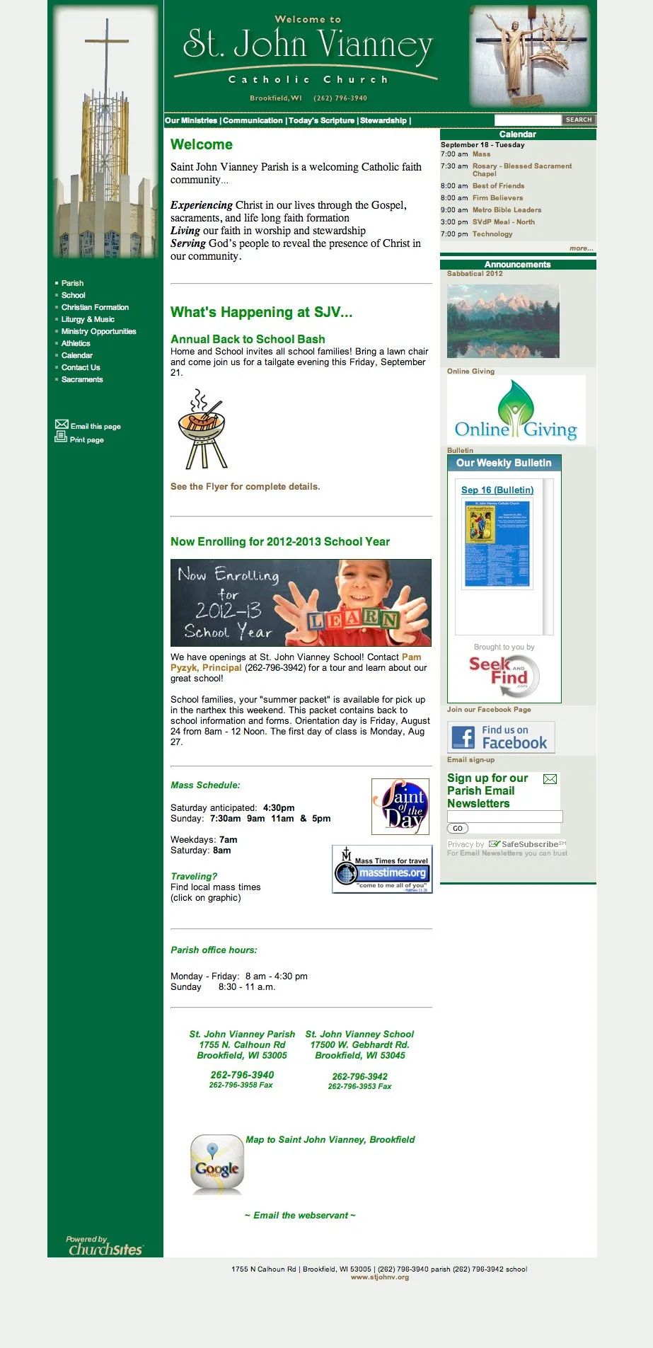
Original Parish Homepage (version 2.0)
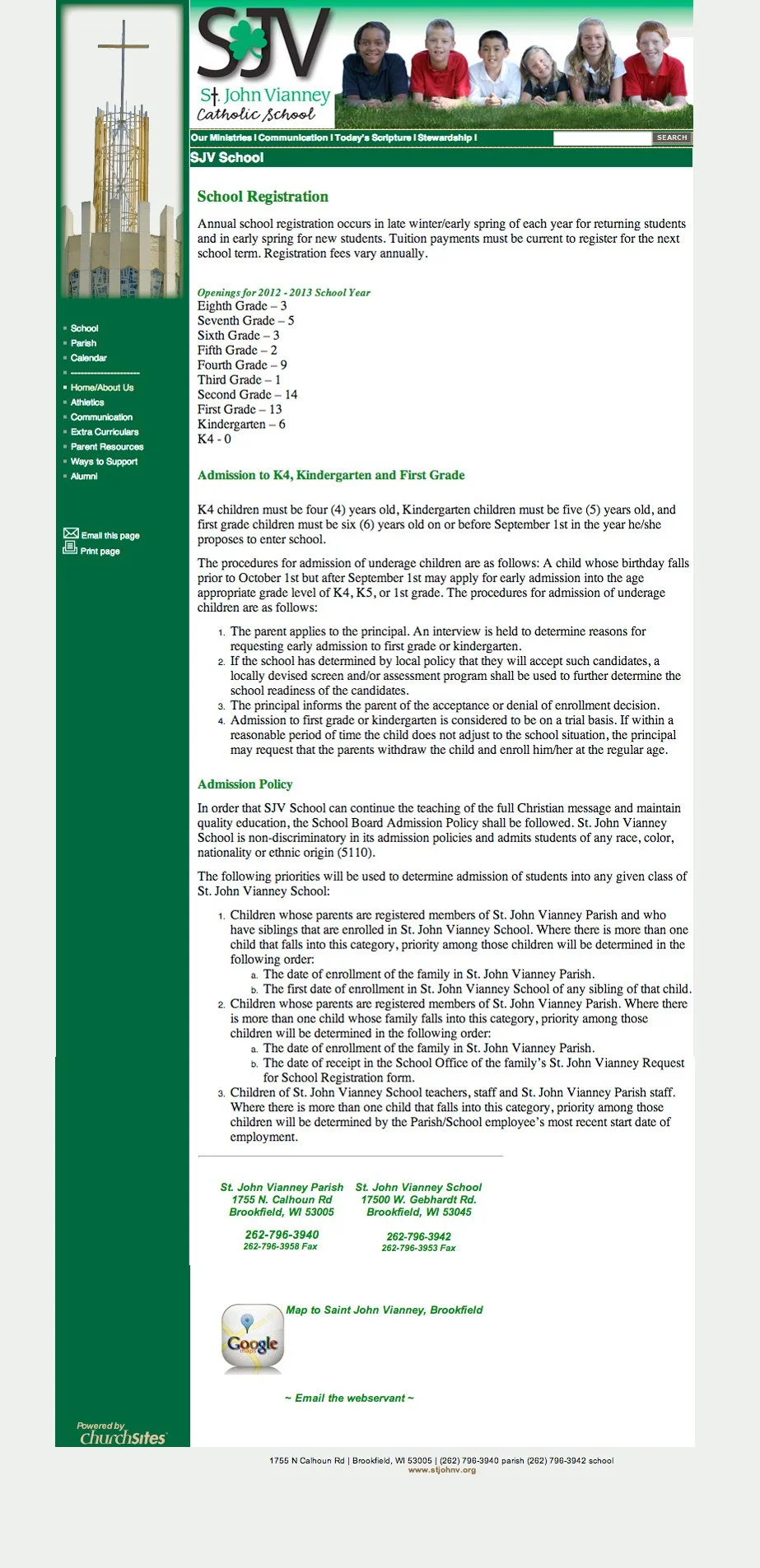
Original School Homepage (version 2.0)
Research Direction
Branding for local spiritual institutions was new. (Higher levels were doing it quite well at the time and dove into social media and institutional branding.) I reviewed institutions across denominations and localities as well as to other types of parallel commercial organizations for aesthetics, functionality, features, and content. Few institutions were doing it well at the time. Some places simply had logos and not much more. Harshly-gridded and long rambling pages with garish palettes was the look of the time. The goal was to make it a better product from every angle and extend that product to other touch-points to support the mission. Pixel polishing at its finest. 👀
Design & Rationale
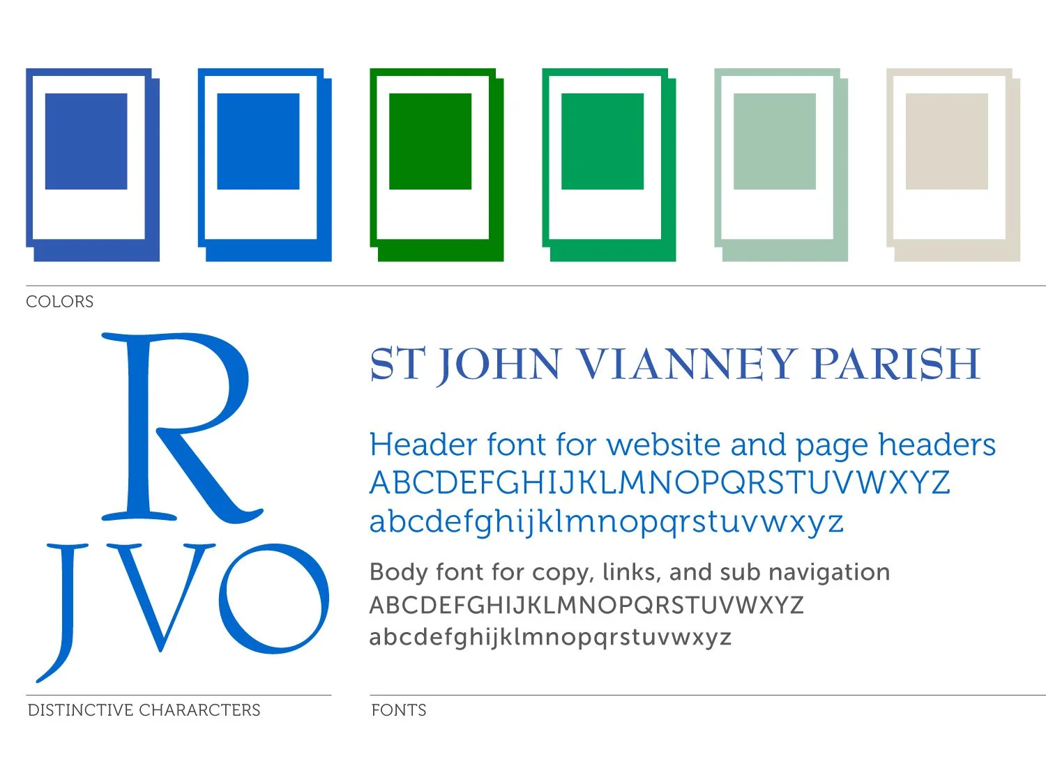
Draft Copy
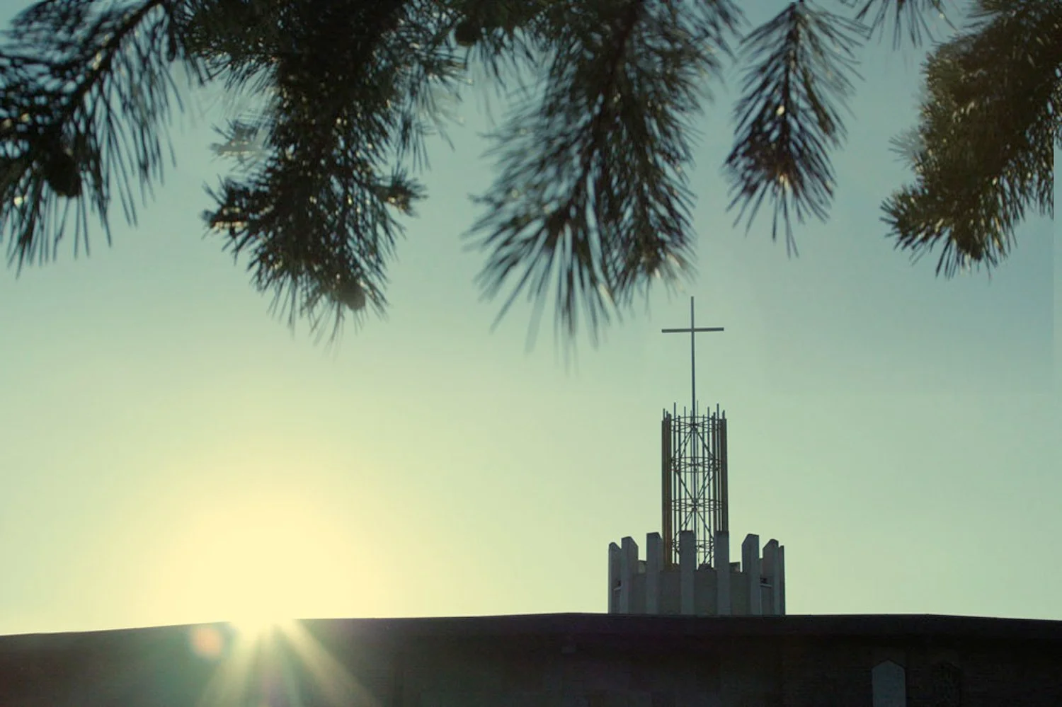
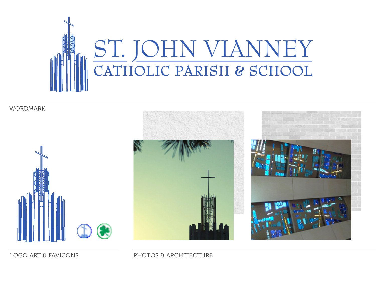
Much of St John Vianney’s aesthetic is established by the modern mid-century building. The architecture and historical roots set the tone for all branding decisions. The soaring cross over the sacristy is its visual distinction as well as a stone carved cross on the south side of the building.
This tower cross would become the cornerstone of the logo as well. A hand sketched version of the tower became an unofficial working logo for many years. I redrew the logo as a vector and typeset a professional version.
The aesthetic references a traditional, welcoming, and peaceful approach. 👩🏻💻
❋ AestheticSt John Vianney is emphatically French in origination. It was extremely important to point to this connection. The parish has a history of having many Irish attendees and they have impressed upon the branding the strong Irish green color on the culture and aesthetic, despite the blue coloring of the sacriststy. The interior color, architects built a beautiful French blue sacristy which is still the most unique structure of the building and the heart of its space. A still and sacred space, the main color needed to reflect this. The green remained in the school association as the school had a much deeper push to asert the Irish vibe adding a shamrock to the school’s visual vocabulary and there was no changing it. A rich transcendental blue was chosen out of respect for St John’s heritage and a nod to his deep instinctual faith. The blue could live cofortably side by side with the demanding green palette. Green and blue play well together in many shades and intensities. It is a color war that lives deep in the culture and can be confusing from the outside to embody a French name and saint donning Irish colors.
❋ Colorscoming soon
The logo font is a….
The website font is a
❋ FontsA talented retired editorial photographer and resident, Bill Meyer, provided amazing lifestyle photographs to feature on the website. I optimized and utilized the images for use in a carousel slideshows to be swapped as needed to reflect current events and liturgical seasons. The photos were used across all touch-points and were a fantastic and welcome asset to the branding.
The signature cover image was done by an anonymous friend of the church who I hope to discover and credit. It was a wonderful asset that set the tone and created a bridge between the blue and green palette battle as it drew upon nature of the environment and building to wed the colors.
❋ Photos Traditional • Welcoming • Peaceful
〰️
Traditional • Welcoming • Peaceful 〰️
Results
Google analytics was installed on the back end and optimized to capture data. The community was very eager to have a new website that showcased all they had to offer and welcome new people. They were very motivated and ready to use the site. Migrating to a useable and beautiful website was an easy natural progression of their digital culture. Some shuffling of information took place, and it was a very smooth transition to a beautiful new digital presence. 📊
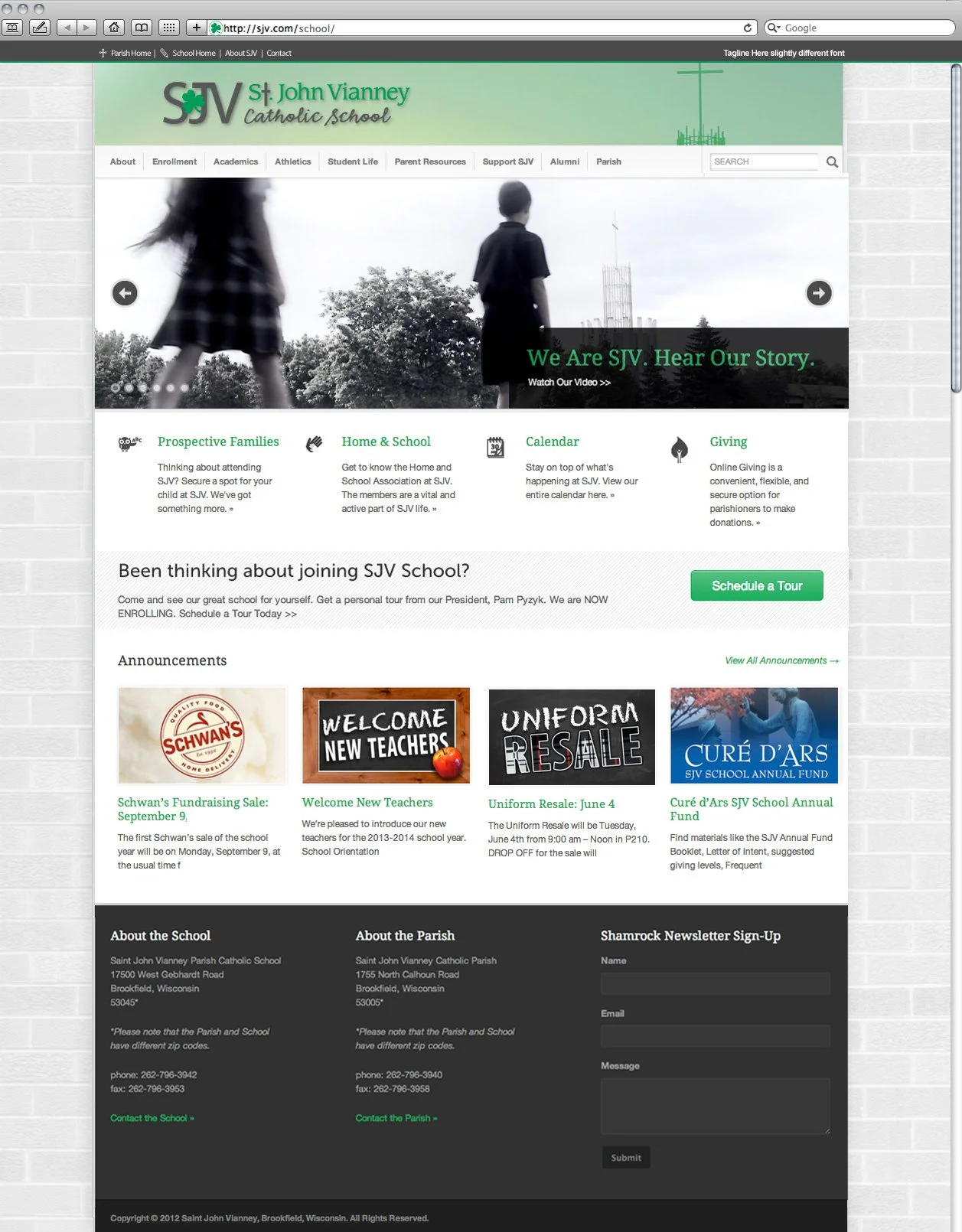
School Homepage, Long Scroll View
Video Still in Carousel
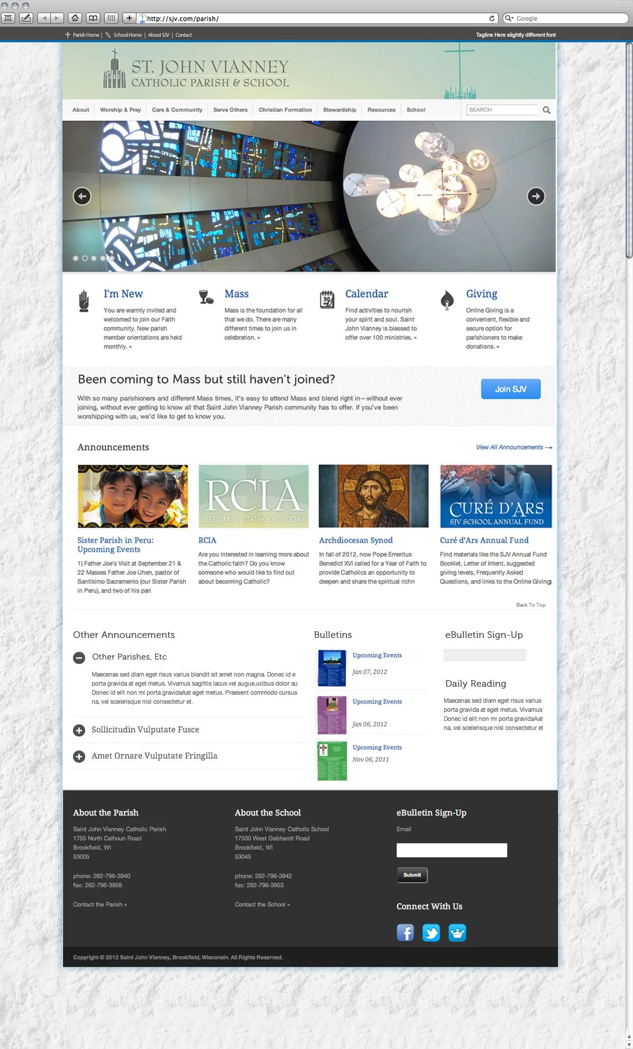
Parish Homepage, Long Scroll View
Signture French Blue Sacristy Windows in Carousel
Bonus
A professional design firm produced and released a school commercial right after the website redesign launched. It was an added bonus that helped amplify the strong branding, unified presence. 🎯