

Public Information SystemChenequa
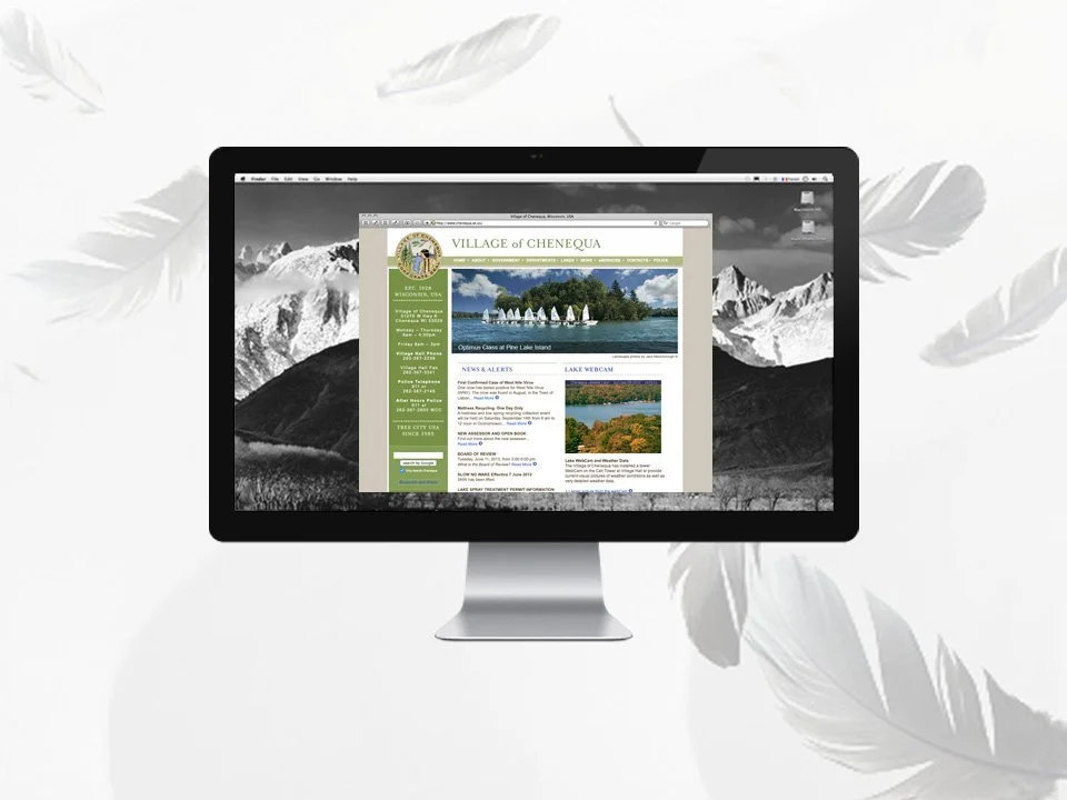
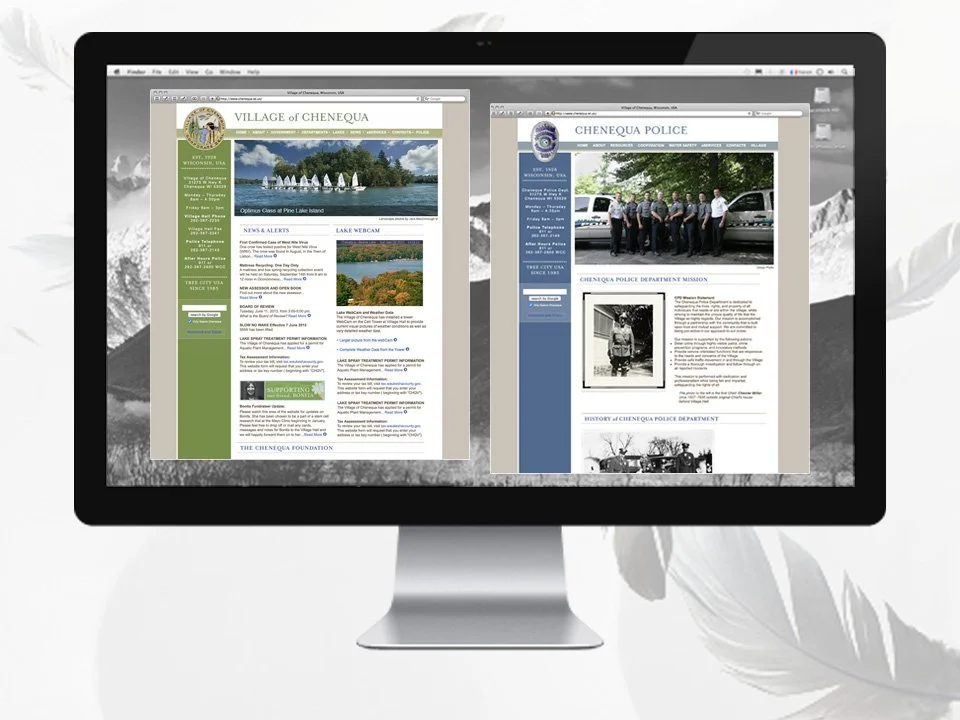
Village Homepage in a Desktop Browser
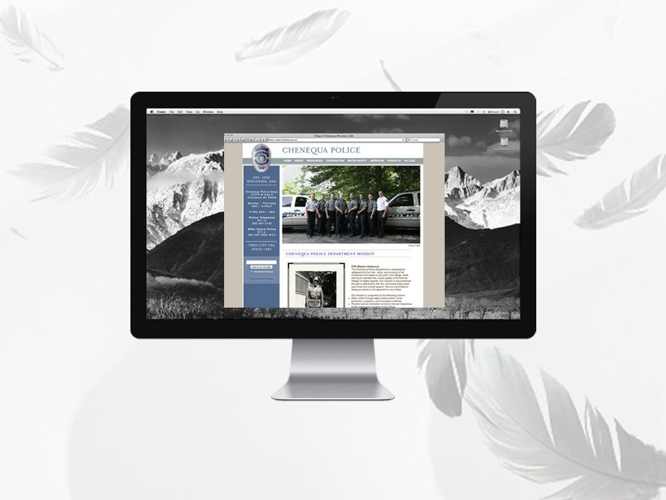
Police Homepage in a Desktop Browser
Project Management:
Senior Graphic Designer & Creative Consultant
From start to finish, I pitched, planned, led and launched a complementary set of websites for a local village and police department. The redesigned public information system included 77+ webpages and 350 municipal documents. I structured the content, navigation and visual systems to improve accessibility, usability and developed a long-term cascading style sheet and SEO best practices.
The Situation
The village needed a proper website to organize all the municipal information. From basic queries and forms to ordinances and meeting agendas and minutes, information was frustrating to find. The site was visually and informationally disorganized and chaotic. There was one main long scrolling menu anchoring on the left side of the site. At the top there was a spreadsheet type frame holding the village seal, name and address and village hall photo. The police department was especially challenging to navigate as it lived “nested” within the village website structure instead of beside it. Overall, it was an explosion of information and colors. 💫
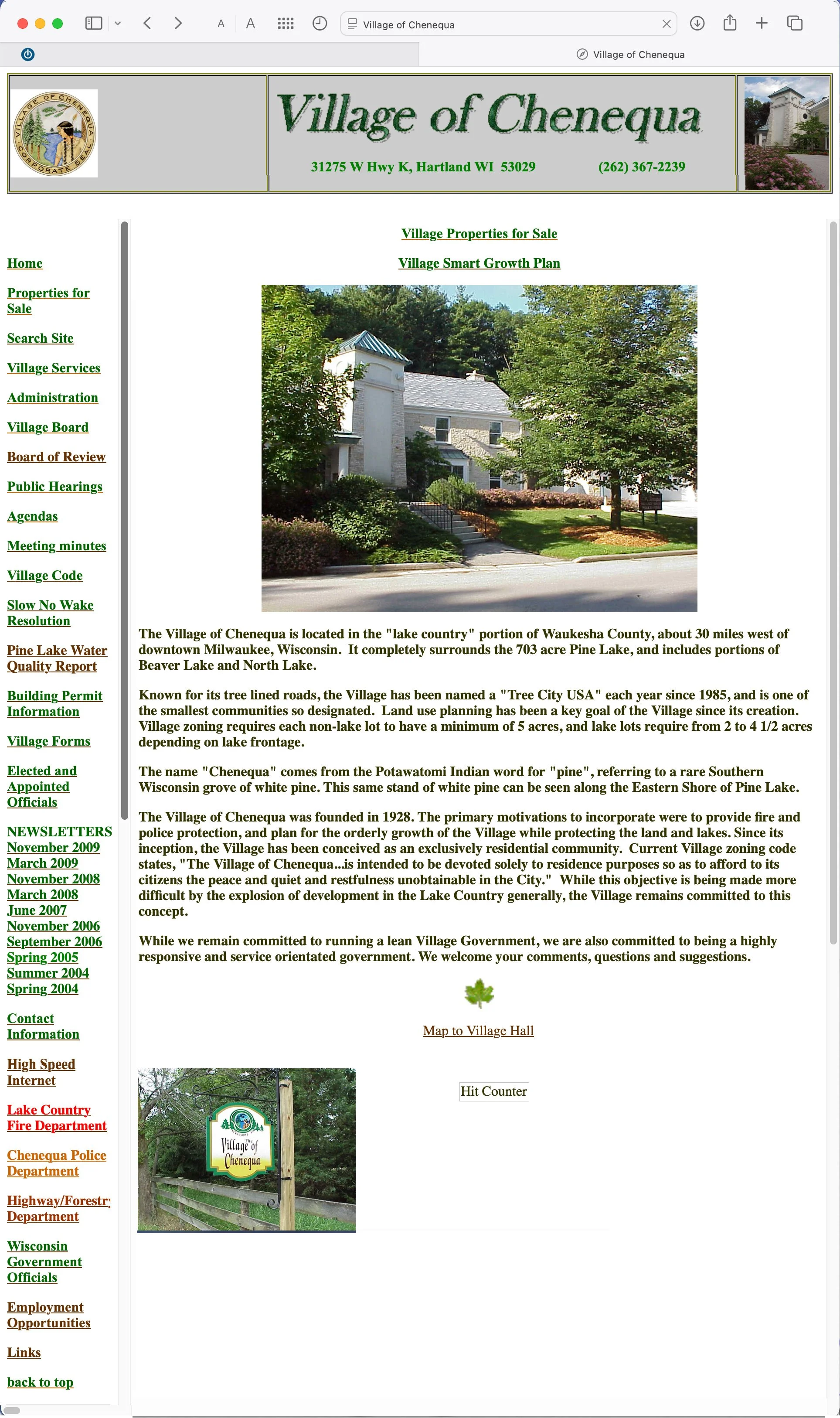
Original Village Homepage
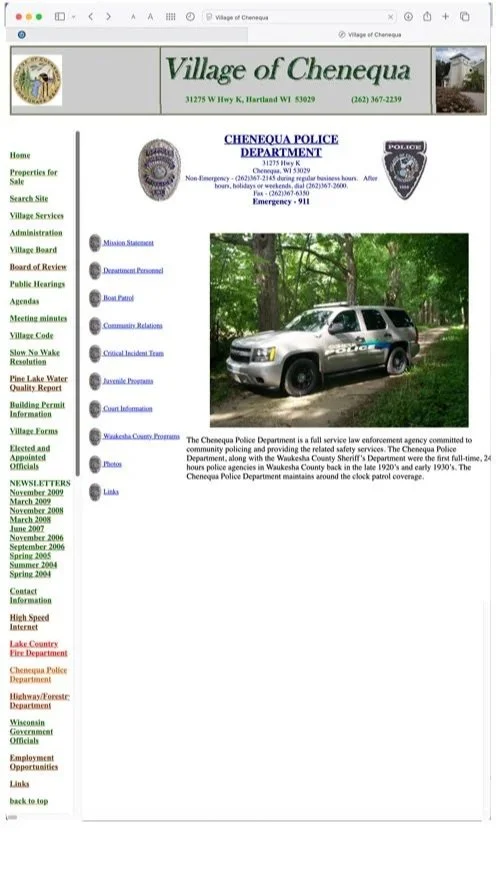
Original Police Homepage
Research Direction
Branding at the municipal level was new. I reviewed other municipalities and other organizations websites for aesthetics, functionality, features, and content. Few municipalities, especially smaller ones, were doing it as well as commercial entities were. Some places simply had logos and not much more. Harshly-gridded and visually garish webpages was the look of the time. The goal was to make it a better product from every angle. Pixel polishing at its finest. 👀


Design & Rationale
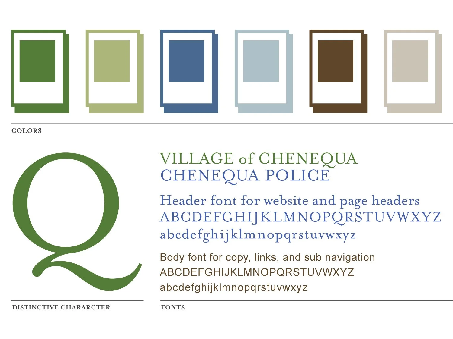
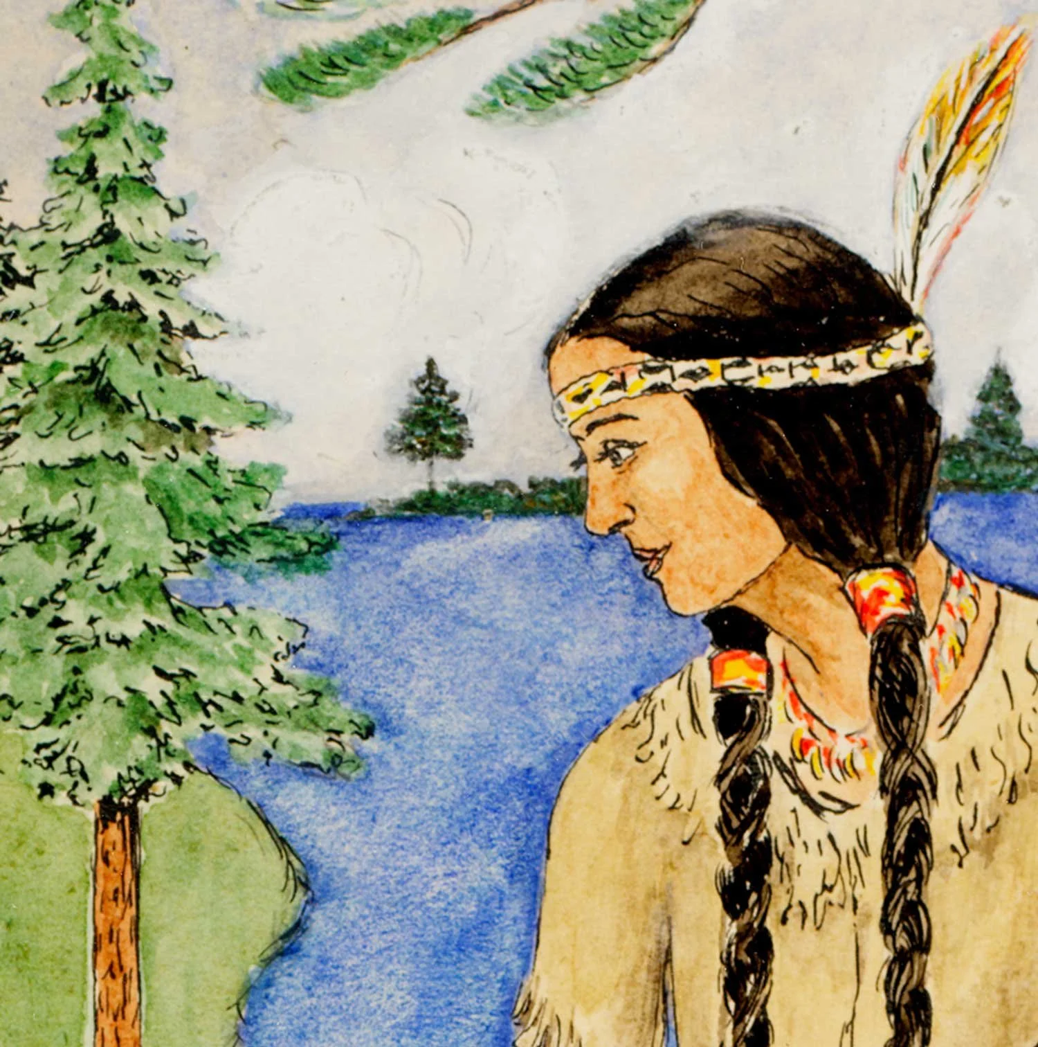
The village seal was the one main piece of available and appropriate artwork usable for the design making it a natural starting point. The aesthetic called for a traditional, friendly, and information-rich approach.👩🏻💻
❋ AestheticThe Earthy Green and Warm Neutral Gray colors were selected for their natural aesthetic. Green was mainly used for the village representing the land and nature. A corresponding Earthy Blue was chosen to represent the police department and the water orientation of the community. The municipality was designated a “Tree City” and during the redesign, and also became known as a “Bird City.” The village was naturally proud of the designations and wanted to highlight them on the website.
❋ ColorsThe main font is a transitional serif font that is a modern take on Baskerville. It is a nod to tradition that remains friendly and interesting. The font has little extra flairs as seen in the letter “Q” in the village name. This font was also used for the Main Headers and anywhere where small amounts of graphical type could safely be used to be visually pleasing and still technically useful. Text as imagary was an aesthetic work-around of the time and used sparingly and wisely.
The body font is a traditionally paired sans serif font that works well visually and on the back end in the days of few font choices. It was a web-safe font know for its ubiquity and legibility. It could be clean and sharp even at lower resolutions due to its larger x-height.
❋ FontsA wonderful local photographer and resident provided beautiful nature shots to feature on the website. I vibrantly retouched and optimized the photos for use in a seasonal slideshow to be swapped each quarter: Spring, Summer, Fall, and Winter.
❋ Photos & WebcamNatural • Historical • Peaceful
〰️
Natural • Historical • Peaceful 〰️
Results
Google analytics was installed on the back end and optimized to capture data. As for the community they were not very interested at the time. They were very outdoors focused and lived in the village to get away from the grind of a city and technology. The land and lakes were a respite. Migrating to a useable and beautiful website would take time and staff direction and the enthusiasm of early adopters. As the community used the site, it fielded more inquiries and reduced the need for personal visits to village hall or police department. 📊
Bonus
The researched and gathered content became so useful that employees fielded outside calls from the public looking for more information. The website content was reaching people well beyond the community as a source of public information. 🎯